Somethings about my top panel in GitHub Page 1
side bar
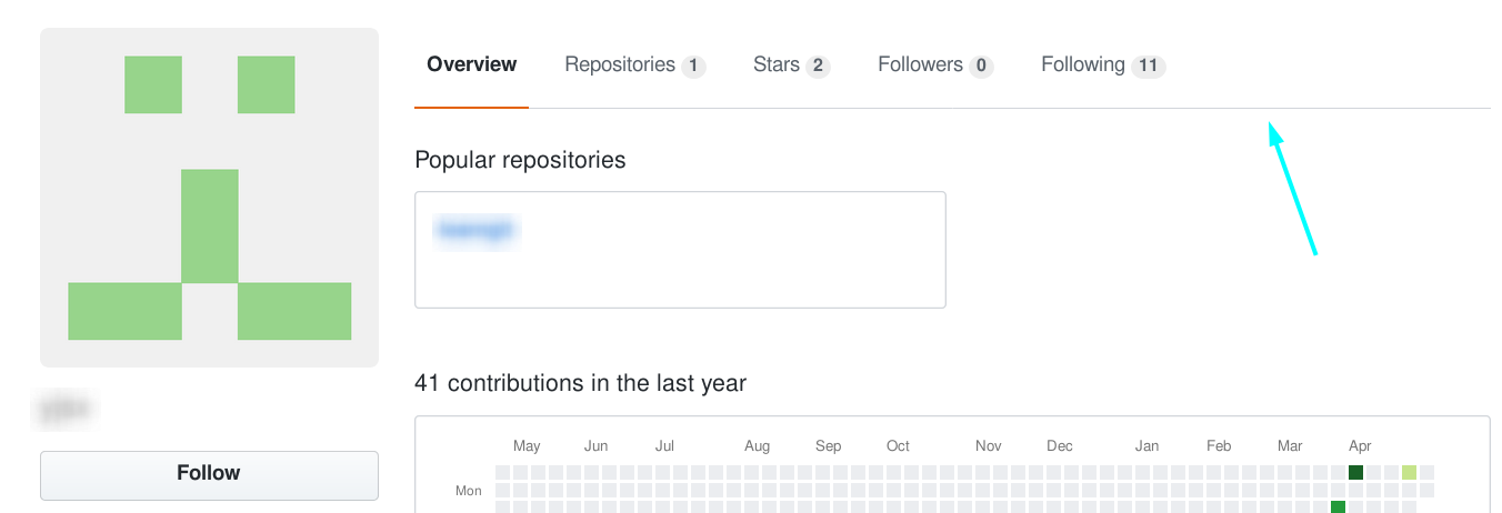
After I established my GitHub Page, I want to make a list of links to my different parts. But because I use jekyll, not hexo or others, it seems I can’t add side bar or some things similar directly (Maybe it caused by my weak ability of searching). So I make all links on the top of every post. However, it is troublesome and not convenient, I saw some websites (include GitHub) have roll-fix top panel, which can be static when it isn’t in the top, and keep fixed when its top reach the upperside of page, like right
It need to use javascript, and I didn’t learned javascript, so I can only use their code and did some modification to fit my need (for example: this is an example tutor). Because the content of my blog is inside the inner part of GitHub Page, so the width of top panel is the same as inner part, and can’t fill the whole page. So I decided to use side bar.
Put the home link and category link in the top part, and link of categories devided into two columns, that’s the first version.
get out of inner!
However, the side bar is very ugly (maybe relate to my bad design), and it will interfere the view in mobile phone, so I decide to change back to top panel. However, I don’t want to put much code in layout, I only want to do some modify in the origin theme GitHub offered. And I found the narrow part is in a section of class inner, so I can use a </section> to end it in advance, and then put the code of my top panel, and put another <section> tag to place contents. So the version 2.0 is changed to top panel and make it jump out from inner part.
And, still in the mobile end, because the too-narrow space, links will crowded together and became very ugly, so I use a trick: to omit some contents according to the width of screen, this can be realized by css:
@media(max-width: 400px){
    #files{
        display: none;
    }
}
get on the top!
However, black is a little ugly, I like the style of sites such as GitHub, I want to use that style.
So I adjust the background of panel to the color same with site background. However, because there is an empty <section> upper, so there is a big blank upper than the panel, It’s ugly. After searching, I found I can make margin-top to negative when it’s static, And then the top panel is cling to the black header (you also need to assign this value in css, or it will not work before you scroll)
get rid of inner section totally!
But another problem occured: I can’t click the links in inner part when panel is static. Then I found the inner section is in front of panel, and after I raise the position of panel, it will shelter the panel.
But z-index didn’t work. The position have some options, what if I don’t use static? So I change static to relative, and it really works!.
include other repoistories
With the experience shared by a predecessor, I make two other repoistories as GitHub Page, and also linked them in my top panel. But they are not in my main repoistory, so they didn’t have panel. So I copy the content.html and _config.yml to them, hope they can also have panel, it works but links are all wrong. I use a variable which stores url of my main page in _config.yml and then refer it in every link, It finally works properly.
Update 2021/10/22
Now you can directly use css to implement this effect, using style="position: sticky;".Reference: Firefox: Scroll-linked effects
-
This top panel is a long-term project (, and these things mostly from my memory, so some things may not right, If you are interested in the process of my top panel, you can check history versions of my GitHub Page, I hope this essay can be useful to you. ↩